
Jason Guevara
Last updated January 2023

Jason Guevara
Last updated January 2023
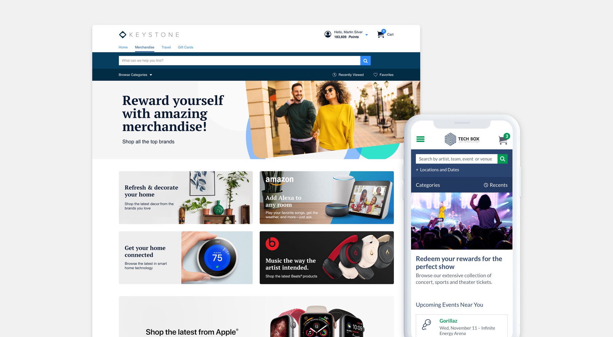
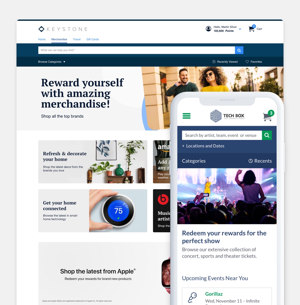
Keystone is a white-label, SaaS platform. It enables users to redeem rewards for things like electronics, travel and event tickets from a wide network of suppliers. Before kicking off this project, the state of the platform was visually outdated and the configuration experience was in need of a technical and functional update. We redesigned the platform in order to improve usability, scalability, consistency and accessibility.
Responsible for collaborating on research and end-to-end design. I led efforts on the Merchandise, Gift Cards, Event Tickets, Custom Store and newly established Promotions branches of the platorm. I contributed to aspects of the Travel storefront as well.
Solo designer with input from the wider design team, 2 Business Analysts, and 15+ Engineers.
🔮 This is a simplified overview. To learn more,
get in touch →
The Keystone platform, formerly New Core, was in need of a UX evaluation and UI refresh having last been updated in 2013. The former UI didn't allow for efficient scaling in order to incorporate new features originating from both client needs and internal initiatives.
On the performance front, KPIs like Conversion Rate, Bounce Rate and Abandoned Carts exhibited room for improvement. Additionally, the push toward more inclusive design by way of ADA (AA) Compliance added another dimension to the requirements not previously incorporated in the last effort.
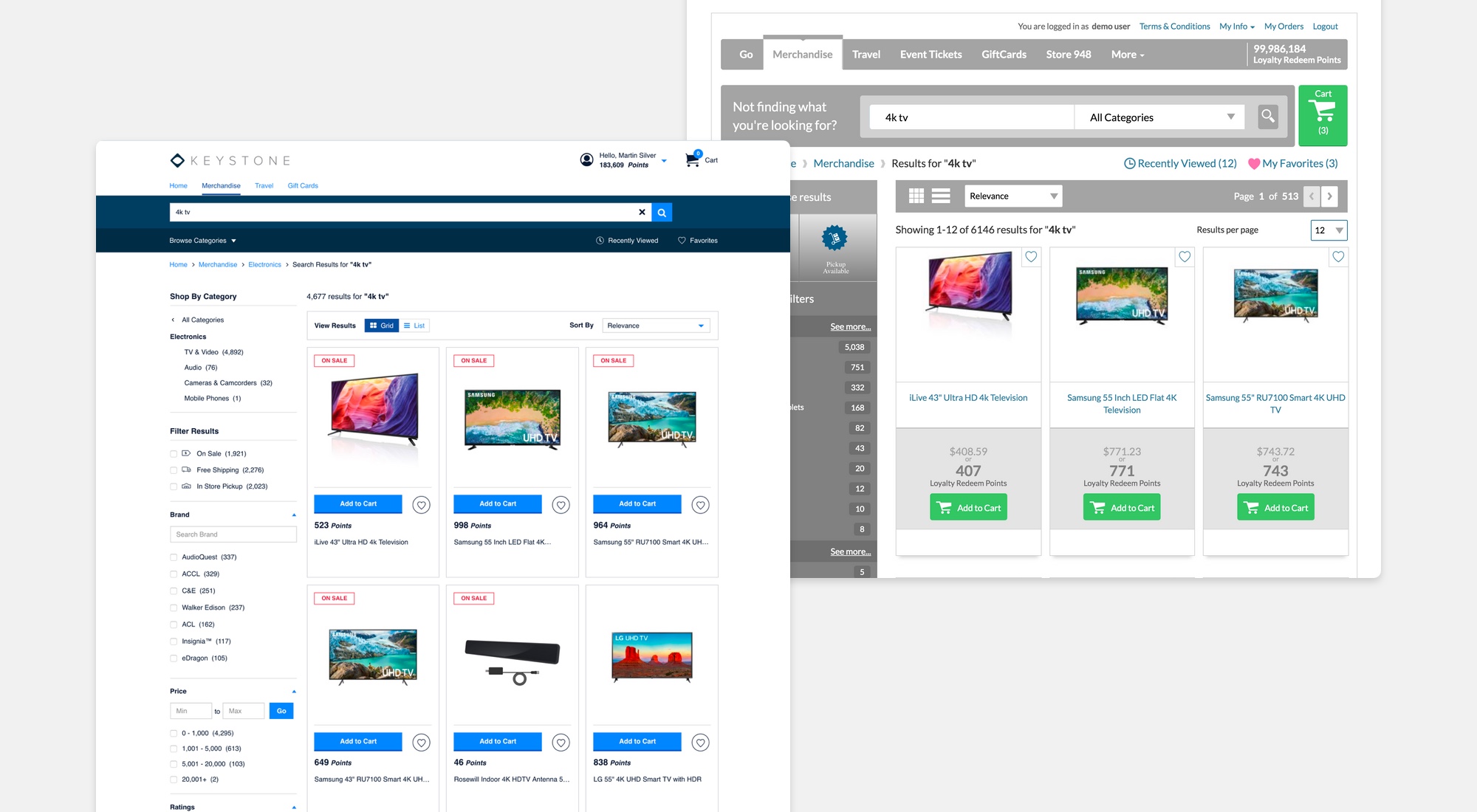
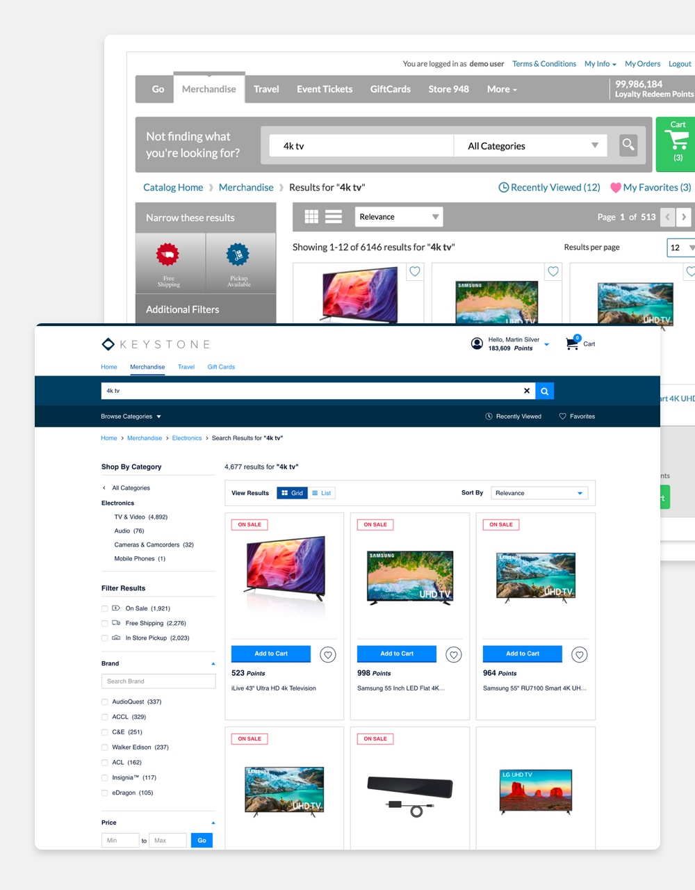
Before and after view of the merchandise search results page.
An emphasis was placed on usability research, competitive analysis and testing in order to identify pain points within the existing UI since only baseline analytics and sales numbers were available. These findings helped define the principles which set the tone of the UI design and organization for Keystone.
To improve scalability and consistency throughout the experience, a design system was created. This helped in decreasing UI defects during the development process. Also, the Keystone Design System aided in making the on-screen elements more scalable through the creation of modular components.
Inclusivity and accessibility were taken into account during the creation of the updated experience.
Privacy limitations: Given that a majority of the client base for Keystone are banks, privacy requirements made it difficult to attain detailed analytics in order to diagnose pain points in the experience. This also put a strain on using cloud-based usability testing services to garner more feedback. We were put in the position to run in-person testing in order to collect insights.
Configurability: The white label nature of the product meant in-depth consideration had to be made to account for all available configurations. From pricing display variations to custom navigation and user menus, the variability of Keystone put our modular and scalable design abilities to the test.
Data inconsistencies: Multiple feeds means a variety of data formats between suppliers. Creating a seamless loyalty redemption experience for users meant evaluating the data and grooming it for consistency.
Discontinuity between teams: With developers and QA testers being pieced together from different teams made communication and explanations of concept challenging. The previous UI implementation did not utilize clearly defined guidelines for common elements and components. This realization sparked the need for the establishment of a design system.
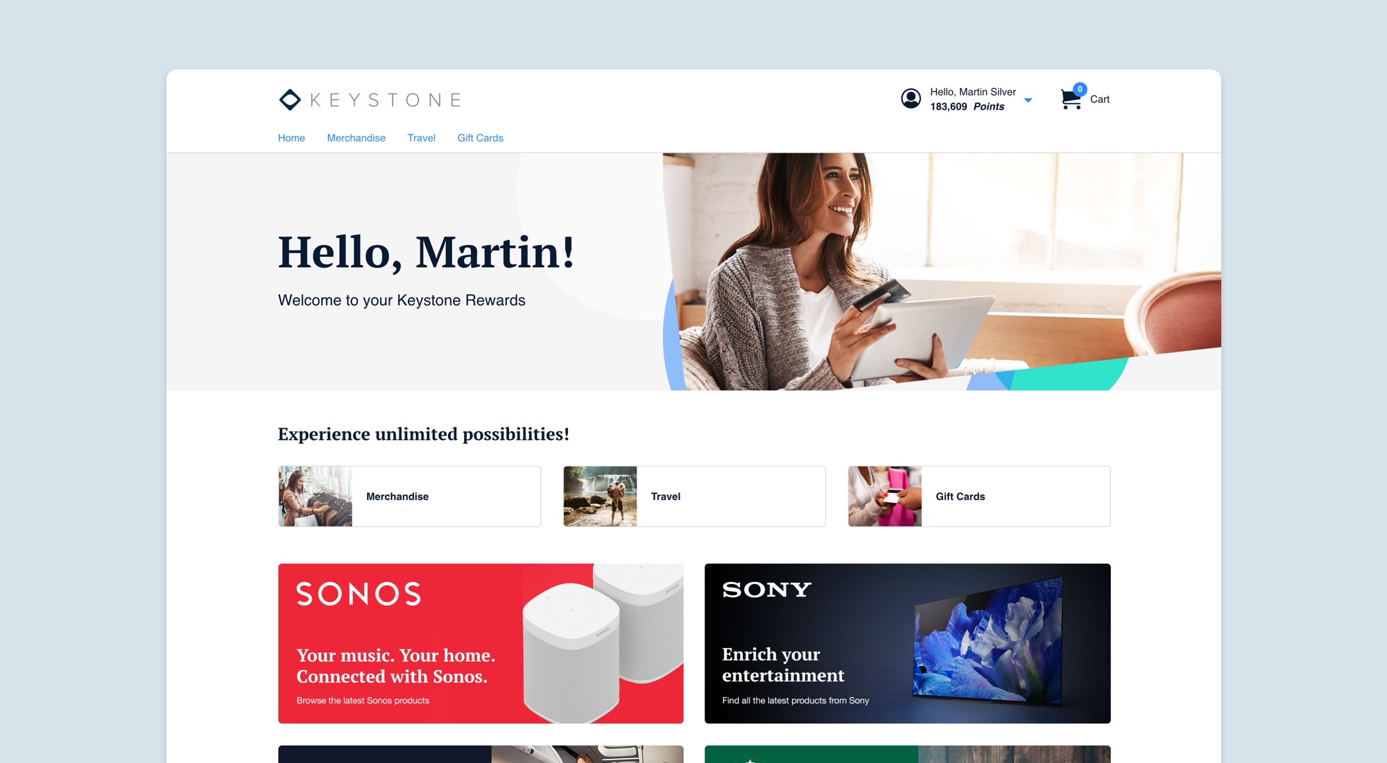
Configured home page.
I began my discovery phase by interviewing those account and product managers familiar with the existing product. These team members are typically made aware of any usability issues. Once I compiled the responses, I then dug through the lean amount of analytics reports available. Noting pages with unusually high exit and bounce rates led me to investigate those instances further.
Noting that UI inconsistency and misleading visual hierarchy were the commonalities between all of these target pages, I then formulated a plan of attack via competitive analysis and usability research. It became clear a design system was going to help establish consistency and a common reference for designers, developers and QA team members. Also, an overhaul from an IA perspective would go a long way in providing a more clear, direct experience for the user.
The Keystone Design System serves to define individual, reusable components to help ensure consistency throughout the multiple storefronts. Direction for the treatment of default type, color, imagery, icons, spacing and hierarchy are detailed out as well.
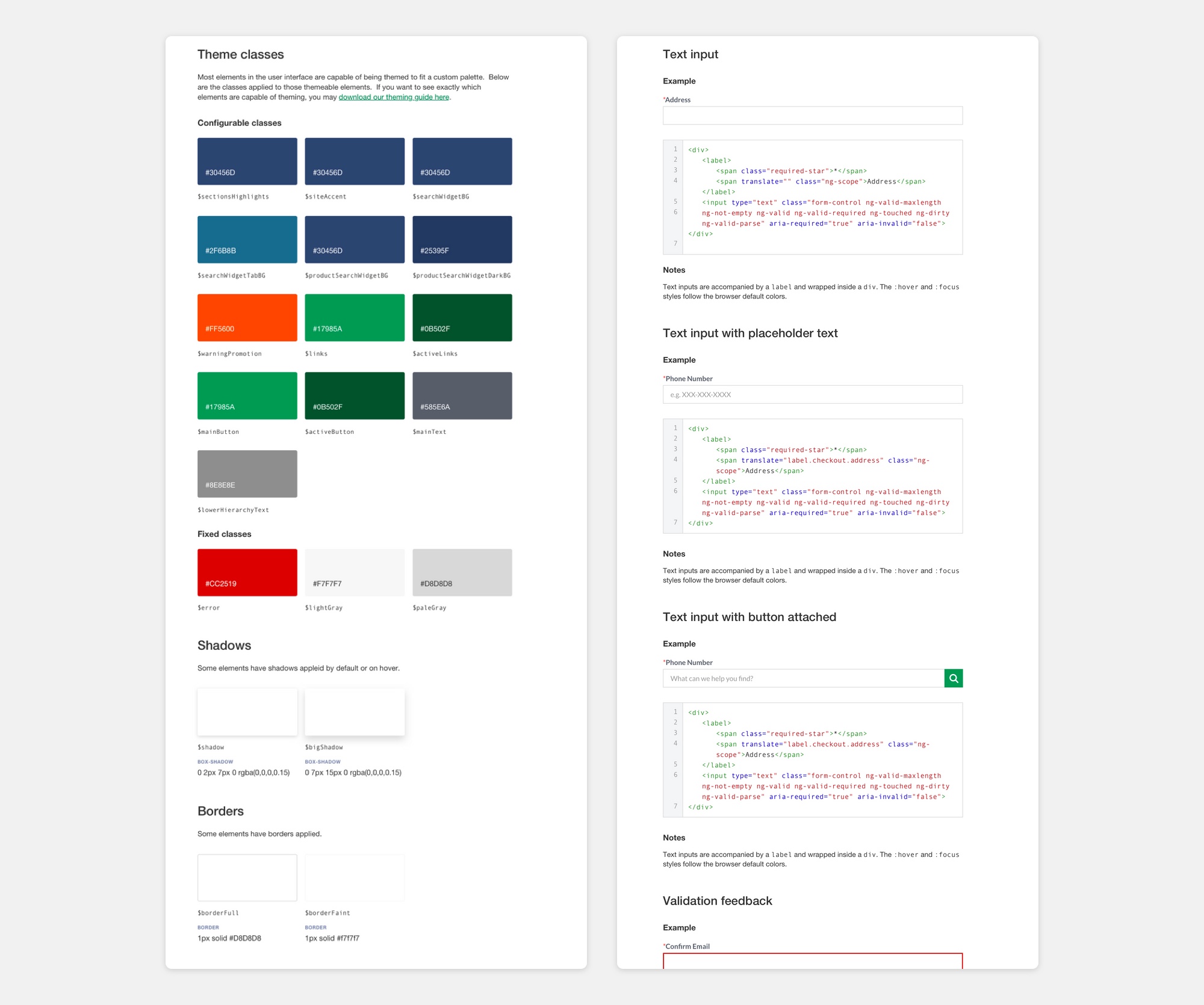
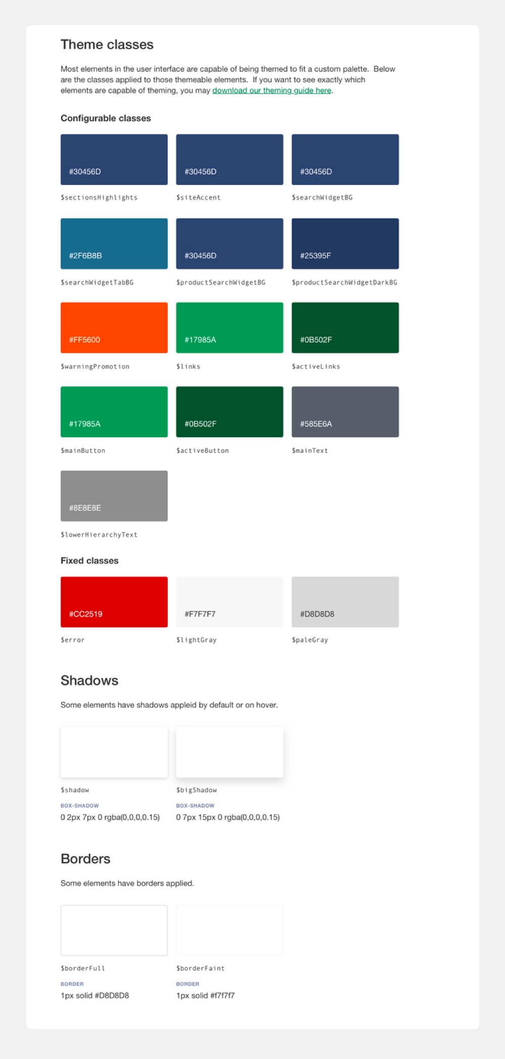
Example of the Keystone Design System definitions.
Beginning with low fidelity sketches and wireframes to establish the basic layout and interactions of the UI, I began the process of garnering feedback specifically on those previously defined user trouble areas. I then graduated to more high fidelity prototypes once internal approval from the product owners was achieved.
Periodically, in-house testing garnering mostly qualitative data was done to ensure improved usability over the former product.
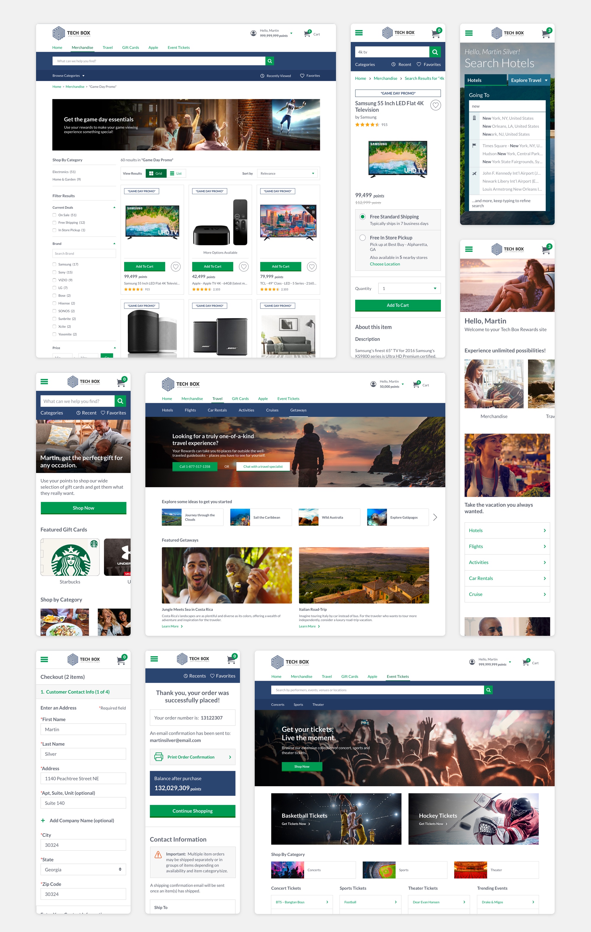
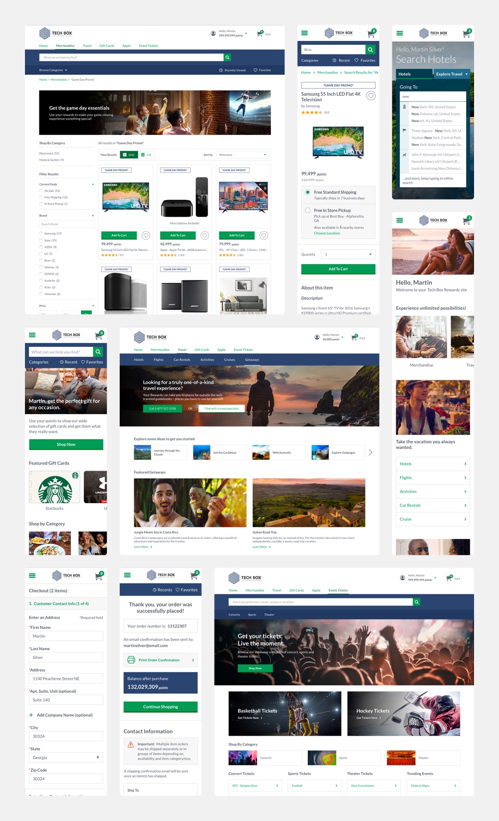
Various screens from the different storefronts.
Advocating for more extensive methods to track user behavior and engagement has led to a more in-depth implementation that allows a more detailed look at how users interact with the product.
With a roadmap of new features for Keystone on deck, the process of enhancing the user experience is ongoing.
Existing clients migrated to Keystone
New clients since launch
Increase in conversion rate
Decrease in abandoned carts